Saturday, February 21, 2009

Illustrator Tutorial: Wooden Frame

1. Creating the frame

Select the Rectangle Tool, hold Shift to draw a square. Select the square and go Object>Path>Offset Path. Enter a negative value for offset. Select the new square and offset the path again. Now, enter -2mm for the offset value. We now have the basic frame done.

2. Dividing the frame

We need to turn on Smart Guides for snapping to work. Go view>Smart Guides, and make sure it is checked. Select the Line Tool and go near the corner of the outer square. The anchor text will appear when it detects the corner. Click and drag to the inner corner to draw a line that snaps perfectly to the anchor points. Repeat this steps for the other 3 corners.

3. Breaking into shapes

Select all the shapes and use Divide from the Pathfinder. This will break the shapes into pieces. Press Ctrl/Command+Shift+g to ungroup it. Select the inner frame and fill it with different colours to create the bevel effect.

4. Applying texture

Select the texture we have done on our previous tutorial and drag it over the top frame. Make sure the layer is below the top frame. Select both shape and select Crop from Pathfinder. This will make the shapes crop to the frame shape. Repeat this step for all sides.

5. Placing the photo

Select the Rectangle Tool, and draw a brown square with the size of the photo frame and send it to the back. Draw a square in the center of the frame. Place your favorite photo over the square using File>Place. Make sure the square is above the photo. Select the photo and placeholder. Right-click and select Make Clipping Mask to crop the photo to the placeholder.

final wooden frame

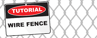
Illustrator Tutorial: Wire Fence

Learn how to create a wire fence pattern from scratch using the line tool.

1. Drawing the Zig Zag Fence

First, select the Line Tool from the Tool Palette and draw a long straight vertical line. This will determine the fence height. Go Effect>Distort & Transform>Zig Zag to apply the zig zag effect. Adjust Ridges and Size to set the fence mesh shape. Make sure the Points is set to Corner.

Now we will round the corners. Go Effect>Stylize>Round Corners and enter the radius to round out the sharp corners. Next, set the Weight of the Stroke to 5pt and set it to dark grey color.

Select the line and press Ctrl/Command+C to copy it and Ctrl/Command+F to paste a duplicate infront. Set the duplicated line weight to 1pt and change the stroke color to light grey.

2. Blending the Wire Fence

We will now proceed to blend both lines to give a 3D look. Go Object>Expand Appearance to expand the effects. Then go Object>Expand to expand the strokes. The stroke will now turn into shapes. With both shapes still selected, go Object>Blend>Make to blend both shapes. Next, go Object>Blend>Blend Options and set the Specified Steps to 3 for Blend Options. Finally, we will need to expand the blend before diving it in the next step. Go Object>Expand to expand the wire.

3. Dividing the corners

Now, select the line tool and draw straight lines over the corners of the wire. We will need to break it into individual segments so that we can achieve the wire twisting effect. Select everything and go to Window>Pathfinder and select Divide. Press Ctrl/Command+G to ungroup it.

Select each individual segments and group it by pressing Ctrl/Command+G. Do this for all the segements.

4. Creating the Fence Pattern

Select all and press Alt/Option as you drag a new instance beside it. Offset it until the edges touches the next wire as shown on the left. Select all and press Alt/Option while holding Shift to create a duplicate beisde it. Press Ctrl/Command+D to repeat the steps to generate a row of wire fence.

We notice that the wires are stacking on top of each other. To create the twist effect, we will need to send some segments of the wire below each other. Starting from the top, select a row of segments you want to send down and press Ctrl+Shift+{ / Command+shift+{ to send it to the bottom. Repeat from the top to the bottom, until you achieve the twist effect for the fence.

5. Final Wire Fence

Here is the final wire fence. Hope you find this trick useful for creating repeated patterns.

Make a Torn Vector Desktop Wallpaper with Angled Text


Step 1

Set your document up to whatever size you want to create your desktop at. After that, draw a rectangle using the Rectangle Tool (M) and fill it with a color of your choosing. Put this rectangle on its own layer. Whenever you are making a design that has several elements it is a good idea to put each item on their own layer too. Keep this in mind while you add more objects to the design, as I will not be pointing out when I add new layers in this tutorial.

Step 2

Add a witty and short saying that you can break up into multiple pieces to create a design. I've used ITC Franklin Gothic for my text. To quickly access the type panel press Command + T.

Step 3

Angle the type to give it a unique look. Angling the type is as simple as selecting it and hovering your mouse near one of the corners. Using the Direct Selection Tool (V) when the cursor changes to a double-sided arrow you can rotate the type. When you are rotating the type hold down the Shift key to easily rotate it to a 45 degree angle.

Step 4

When you begin laying out the text, try to arrange it so that the entire saying falls within the center area of the design. As you'll notice, I've gone ahead and placed the larger words in a pattern that I like. Once you do the same you can continue to build the other words around the existing letters.

Step 5

Continue to duplicate the words, mix them up and try different combinations so they fit well next to each other. Quickly duplicate the words by holding down the option key while you click and drag. It's OK to allow your artwork to overlap the edges of the artboard at this point.

Step 6

Observe how the layout looks full and complete (with the exception of the small area on the right that I will add my name and the VECTORTUTS logo to.)

Step 7

To make the texture in the background use a simple ellipse that we'll turn into a Scatter Brush so we can quickly make a texture. Draw an ellipse using the Ellipse Tool (L). Fill it with black.

Step 8

Open your Brushes (F5) and drag the ellipse into the Brushes palette. When you do this a dialog will open up. Select New Scatter Brush and click OK.

Step 9

The Scatter Brush Options dialog has several options to help you create random patterns. Set your Size, Spacing and Scatter to Random. Adjust the small triangles highlighted below to include negative and positive numbers on each slider. This will ensure your brush has enough variety. You of course do not need to adjust the Rotation option as the shape is a circle.

Step 10

Select the ellipse in the Brushes palette then select the Paintbrush Tool (B). Simply draw an arbitrary shape and you'll instantly have a texture similar to the one below!

If you don't like the way the brush is painting, then double-click on the ellipse in the Brushes palette and edit the options. If you make any changes after you've already painted a shape, you will be prompted with the Brush Change Alert dialog. You can Apply to Strokes or Leave Strokes as shown below.

Step 11

Continue to build up your shapes. After you have a mass of shapes built up, you will need to expand them. Select all of your shapes and go to Object > Expand Appearance. Once you expand your objects you will see that there are small lines (yellow dot) within the shapes. Use the Direct Selection Tool (V) to select these shapes and delete them. After that, select the mass of dots and use the Pathfinder and Select Add to Shape Area (left green dot), then click Expand (right green dot).

Step 12

You're now left with a mass of dots that are completely merged into one shape.

Step 13

Place the shape over the corners of the artwork. Select all four sections of dots and select Add to Shape Area and Expand as we did in Step 11.

Step 14

You can trim the dots to the edge of the artwork by drawing a rectangle shape over where you would like the dots to be cut off. After that select Subtract from Shape Area (left yellow dot) followed by Expand (right yellow dot).

Adjust the Opacity of the dots by using the Transparency palette. I've decided an Opacity of 29 is suitable for this layout.

Step 15

Make other dots that are white to add another level of interest to the design.

Step 16

We'll add a spotlight effect to the design by drawing a rectangle using the Rectangle Tool and giving it a Radial Gradient. Access the Gradient Panel by going to Window > Gradient. Click on the Gradient Slider and use the Color palette (F6) to fine-tune the colors.

Step 17

Move the entire rectangle over the artwork. In the Transparency Palette select Multiply from the drop down list. This will allow your artwork below the gradient to be seen.

Step 18

To create a torn paper effect draw an arbitrary shape with the Pencil Tool (N). The easiest way to close an open shape is to hold down the Option key when you are ready to close the shape.

Step 19

Still using the Pencil Tool, draw two other torn paper shapes that represent the edges of the paper as it curls upward.

Step 20

Give the curled up part of the paper a black to white gradient.

Step 21

Add an Inner Glow by going to Effect > Stylize > Inner Glow. Set the Mode to Screen and the Opacity to about 25. Your Blur size may not be exactly what I show in my example. Just make sure yours looks good to you, then press OK.

Step 22

Give the shape a drop shadow by going to Effect > Stylize > Drop Shadow. Set your mode to Multiply, your Opacity to about 75, your X and Y Offset to 0 and Blur. Press OK.

Step 23

Repeat these steps for the other side of the paper edge, or while you are applying the effect you can select both curled paper edges so the effect will be applied to both at the same time!

You now have an effective torn paper effect. Place the torn paper over the edge of your artwork to complete the design.

Final Image

Here is what the final desktop looks like. The last step is saving the artwork for use on your desktop. Go to Object > Slice > Clip to Artboard. Finally, go to File > Save for Web and Devices, then save your artwork using your desired settings. All there is left to do is set the image as your desktop!

You should now be well on your way to exploring all of the powerful features that Adobe Illustrator has to offer.


Thursday, February 19, 2009

Help Me !!!

Kekawan...

Tlg Nur... Pls...
Nur dpt Interview Fotografi dkt RTM 26hb nie...
Tp mslh nyew...
Nur x pandai sgt bab2 camera nie... (Mati la... aku)
Mcm ner nk wat... Klu suruh design tue pandai la... nie nk amik gambar... adus... berpinar otak Nur...

Fikir2 mcm x nk g jew... Tp adew owg kt.. klu x g nnt nm black list...
emm... mcm ner yek...

Len minta... Len yg dpt... emm... mcm nk nangis jew....
Adew yg bley bantu x...

Mslh Nur bhgn amali,
- 5 snap shoot
- penilaian berdasar 1) Teknik Fotografi 2) Komposisi 3) Mesej
- kamera 35mm (kmra nie mn nk cr adus...)

tue jew la... Pls... Klu adew yg tau bab2 nie... tlg yew...
Pendapat & pandangan korang Nur hargai teramat sgt....

Thursday, February 12, 2009

Creating Pins in Illustrator


Pins are popular these days, so I thought why not write a tutorial on how to create these in Adobe Illustrator. If you’ve ever wondered how to simulate this realistic looking pin or button effect, here’s your chance to learn.

Draw the pin shape

Creating pins in Illustrator - Draw the pin shape

Draw a circle by choosing the Ellipse tool and holding down the shift key while dragging the mouse.

Fill with a gradient

Creating pins in Illustrator - Fill with a gradient

To the left of the circle is my Geeky Dog that I want to use for the pin, but just for demonstration purpose we'll create an actual pin first and then at the end we'll wrap it with this illustration. Add a radial gradient fill to the circle. I've used orange yellow in my example here. Now change the position of the radial gradient by selecting the Gradient tool in the Toolbox and click-drag while holding down the shift key from the center bottom of the circle towards somewhere above the center point of the circle.

Draw the shiny highlight shape

Creating pins in Illustrator - Draw the shiny highlight shape

Create a new layer by clicking the Add New Layer icon at the bottom of the Layers palette. Double click the new layer and give it the name 'shiny highlight'. Press 'd' on the keyboard to set white as fill color and black as stroke color. Set the stroke to no fill by clicking on the Stroke icon in the Toolbox or Color palette and selecting the 'None' fill option at the bottom of the Toolbox or Color palette (the white square with the red diagonal line). Select the Ellipse tool again and draw a circle (holding down the shift key) that is slightly smaller then the pin's circle. The circle should have a white fill now and no border. Deselect the circle and draw a wider ellipse (with a white fill) on top of this white circle a bit as shown in the image above. Select both the pin's circle and the white ellipse and circle. Click the vertical center alignment in the Option bar (or Align palette) to align everything nicely.

Creating pins in Illustrator - Draw the shiny highlight shape

Deselect the pin's circle. Use the (black arrow) selection tool and click the gradient/pin's circle holding down the shift key. Now only the white ellipse and circle are selected. Click the Subtract from Shape area in the Pathfinder palette and click the Expand button.

Add the shiny highlight effect

Creating pins in Illustrator - Add the shiny highlight effect

Select the Rectangle shape tool in the Toolbox and draw a rectangle on top of the highlight shape. Make sure the rectangle covers the entire highlight shape. Fill the rectangle with the default white to black linear gradient enter -90° as angle value or use the Gradient tool again like you did for the radial gradient for the pin's background. Only now you need to move downwards with the mouse holding down the shift key. Now select both the gradient rectangle and the white highlight shape. Now selecting the highlight shape might be a bit tricky. You can make it yourself very easy by using the Layers palette's "Click to target's" option. I'm referring to the small circle buttons you see on the right of each layer. Click on the arrow to the left of the layer thumbnail of the 'shiny highlight' Layer to reveal all sub-layers. Now click the sub-layer that holds the white highlight shape, hold down the shift key and click the sub-layer that holds the gradient rectangle.

Creating pins in Illustrator - Add the shiny highlight effect

This gradient rectangle will be used as masking effect for our highlight. Now that we have both shapes selected, all we need to do is go to the Transparency palette and choose 'Make Opacity Mask' in the palette's dropdown menu.

Add the image on the pin

Creating pins in Illustrator - Add the image on the pin

Select the gradient circle and copy the shape. Now select the image you want to put on the pin. Make sure the image is one group (command/control + g). To make it easy on yourself, make sure this image is in a separate layer on top of the gradient circle. Drag the image on top of the pin now. Make sure the pin is nicely covered and things are nicely centered etc. Now hit command/control + f (to paste the gradient circle on right on top). Give this circle no fill. Now click the target circle icon again in its layer to select the entire layer. Hit command/control + 7. This way the circle is used as a mask for the image. Hey, it looks like you have almost a pin now :) Almost yes, exactly, because we're not there yet. We need to make it perfect.

Add more depth to make it perfect

Creating pins in Illustrator - Add more depth to make it perfect

I think it could use a bit more depth. Create a new layer on top of the image but below the shiny highlight layer. Double click it and call it 'depth effect'. Paste the circle in front again by pressing command/control + f. Change the colors of the gradient fill to white and black as shown in the image and drag the gradient slider all the way to the right.

Creating pins in Illustrator - Add more depth to make it perfect

Change the Layer mode to Multiply to make the white transparent. Change the transparency to 20% or higher if you believe higher is better. This depends a bit on the color of the image.


design by Nur for Cool Style Graphics.