Showing posts with label vectortuts. Show all posts

Saturday, July 11, 2009

3D Push Pin and a Paper Note in Illustrator

http://img29.imageshack.us/img29/6461/82393136.jpg
For the 3D Revolve Options in Illustrator, we need to create the front view outline shape of the object we want. It always goes from the center point to the outline of the object.

Step 1

Lets start with our push pin. Create a new file. Drag a vertical guide onto the artboard. Select the Pen Tool(P), set the fill color to none, and the stroke to black. Note that you can change the color at anytime later on. Then draw a line, as you see in the image below.

http://img11.imageshack.us/img11/9244/13181946.jpg

Step 2

Select the path and open the Revolve Window under Effects > 3D > Revolve.

http://img212.imageshack.us/img212/9937/98338898.jpg

Step 3

As you can see, we have quite a few options to apply to our path. Select the Preview option. This will give us a live view of our object. Chose the following settings: X axis of -35 degrees, Y axis of -28 degrees, Z axis of 38 degrees, and leave the Perspective at 0.

Click the More Options Button. Underneath the Revolve tab, you will see the Surface Options. Let's have a closer look at the options. You can see one Highlight Point that we can move around by clicking and dragging it. We can also change the intensity of the lights. If we choose to, we can add more highlight points by clicking the New light button. In our case, we don't need to change anything. But you can play around and add more highlights if you'd like.

http://img217.imageshack.us/img217/3166/67056653.jpg

Step 4

Open the Swatch Palette and go to Open Swatch Library and select the Earthtone swatches. I chose a nice blue color. Select the path of the 3D pin and change the color. You can of course choose any color you prefer.

http://img217.imageshack.us/img217/8040/32576938.jpg

Step 5

Let's create the metal pin. Draw a shape like you see in the image below. Make sure that the two points are vertically aligned. You can achieve this by selecting them both with the Direct Selection Tool (A), and press Ctrl + Alt + J to open the Average Palette. From there choose Vertical. Then click OK.

http://img237.imageshack.us/img237/2135/40390219.jpg

Step 6

Select the path and open the 3D Revolve Options again. We'll choose the same settings, since the pin will have to be aligned with the head, but we will add two more highlights. Align them as you see in the image below. Make sure you have the Preview selected.

http://img268.imageshack.us/img268/4241/55779644.jpg

Step 7

Move the pin upwards and behind the red pin head. The shortcut for aligning layers and paths is Ctrl + [ (behind) and Ctrl + ] (in front).

http://img20.imageshack.us/img20/690/86648118.jpg

Step 8

Select the Blue head shape and choose Overlay in the Transparency Palette. This will enable us to see the pin and align it better.

http://img35.imageshack.us/img35/1174/72721442.jpg

Step 9

The pin just looked a little too short, but since we have not expanded any of your 3D effects, we can easily transform the objects. Select the bottom path point with the Direct Selection Tool and lengthen the pin. All our 3D effects will be automatically applied. Then set the Blue head shape back to Normal.

http://img339.imageshack.us/img339/8793/21302601.jpg

Step 10

Create a new layer underneath the pin layer and call it "paper." Create a rectangular shape with the Pen Tool (P). Then choose a light blue color and fill it.

http://img529.imageshack.us/img529/2527/67981679.jpg

Step 11

Copy the rectangular shape underneath by pressing Ctrl + C. Then press Ctrl + B and color it with a linear gradient from black to medium grey. Transform it slightly with the Direct Selection Tool (A) by selecting the points and handles and dragging it around until the shape is a little bigger than the paper shape.

http://img124.imageshack.us/img124/7018/16169254.jpg

Step 12

Select the grey pin part and shorten it so it looks like it pierces through the paper. You can do this by selecting the bottom path point with the Direct Selection Tool (A) and drag the point upwards. The 3D effect will be automatically adjusted.

http://img124.imageshack.us/img124/9507/82489197.jpg

Step 13

Select the Blue pin head and make a copy. While still selected, go to Object > Expand Appearance. This will apply the 3D effect.

http://img8.imageshack.us/img8/474/42228320.jpg

Step 14

Keep the object selected and open the Pathfinder Palette. Choose Add To Shape Area from the Shapes Modes.

http://img383.imageshack.us/img383/6899/96877319.jpg

Step 15

Fill the shape with black and go to Object > Path > Simplify. Move the cursor for the Curve Precision to 100%. This will reduce some points that are unnecessary quickly.

http://img32.imageshack.us/img32/5027/59702201.jpg

Step 16

Select our shadow shape, rotate it, scale it, and skew it until it resembles the image below.

http://img161.imageshack.us/img161/5592/53336787.jpg

Step 17

Apply a linear gradient that goes from a medium to light grey. This will make our shadow look more realistic.

http://img106.imageshack.us/img106/7949/46704503.jpg

Step 18

Select the paper shape and make a copy on top of it by pressing Ctrl + C + F. Then open the Swatch library patterns by clicking on the Arrow on the right hand side of the Swatch Palette. In the drop down, choose Open Swatch Library > Patterns > Basic Graphics > Basic Graphic_Textures. I chose the pattern called USGS Sewage Disposal. Fill the shape with the pattern and set the Transparency to Multiply and its Opacity to 8%. Now we have lined paper.

http://img17.imageshack.us/img17/8401/66584234.jpg

Step 19

Voila, your very own push pin and note paper.

http://img29.imageshack.us/img29/6461/82393136.jpg

Monday, April 20, 2009

Create A Wood Grain Texture

I declare this week Texture Week on Vectortuts. Also like the other texture tutorials, this technique is easy and applicable in logos, icons, interfaces or pretty much anything.

Notes

This tutorial was created with Illustrator CS3.

Keyboard shortcuts are displayed in orange. ⌘ is displayed for the Command key (mac), with the Ctrl key being the Windows equivalent (not displayed).

Rectangles

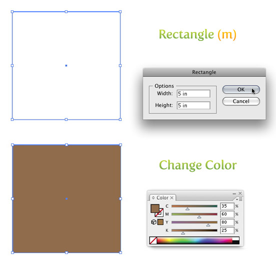
Create a 5 inch by 5 inch rectangle with the Rectangle Tool (m). An easy way to draw an exact rectangle is to click on the artboard with the Rectangle Tool (m) to bring up the Rectangle dialog to enter dimensions. Fill the rectangle with a light brown and take off the stroke.

Rectangle

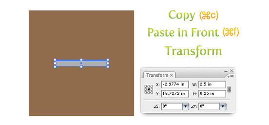
Next Copy (⌘c) the rectangle and Paste In Front (⌘f). With the copied rectangle selected, change the dimensions for the width to 2.5 inches and the height to .25 inches in the Transform Panel and fill the rectangle with a 40% black.

Copy, Paste, and Transform

Texture

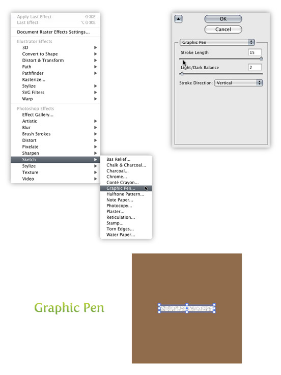
Select the smaller rectangle and go Effect > Sketch > Graphic Pen. When the Graphic Pen Effect dialog comes up, change the following settings.

  • Stroke Length = 15
  • Light/Dark Balance = 2
  • Stroke Direction = Vertical

Texture

Trace and Expand

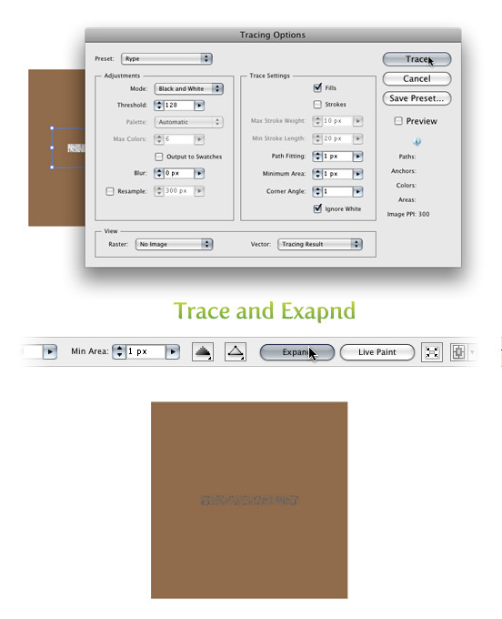
With the texture selected go Object > Expand Appearance. With the texture still selected, the Control Panel defaults to the Live Trace options. Click the arrow beside the Live Trace Button and select Tracing Options. Or you can go Object > Live Trace > Tracing Options. You don’t have to change all the options, just the ones below.

  • Mode: Black and White
  • Path Fitting: 1px
  • Minimum Area: 1px
  • Corner Angle: 1
  • Ignore White: Check this box

I like to save a preset in the Tracing Options. It makes it easy to recall these setting. If you have read previous tutorials, you will see I use these setting all the time for tracing. Next, press the Expand button on your tool bar.

Trace

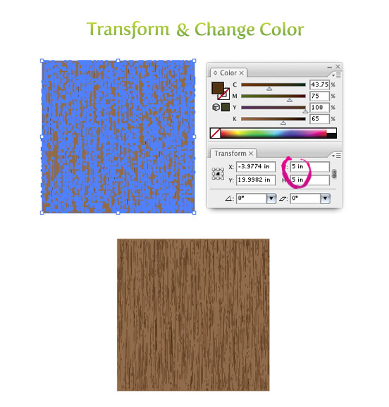
Transform and Color

With the texture selected, change the width to 5 inches and the height to 5 inches from the Transform Panel. Next, change the color of the texture to a darker brown than the first rectangle.

Transform and Color

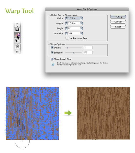
Warp Tool

Double click on the Warp Tool (shift r) in the Tools Panel to bring up the Warp Tools Options dialog. They are probably on the default settings, but if they are not, press the reset button on the right of the dialog. Once the settings are back to default, change the Intensity to 10% and click OK.

Select just the texture and click and drag with the Warp Tool (shift r). I like to go up and down and slightly back and forth. You can do as much or as little as you want.

Warp

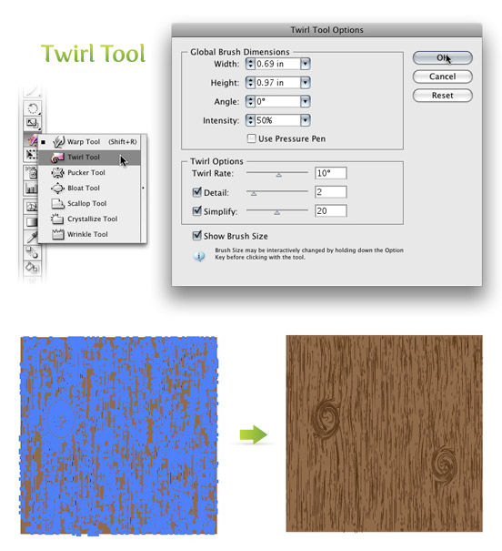
Twirl Tool

Click and hold down on the Warp Tool (shift r) in the Tools Panel to bring up the other transform tools. Pick the second tool in the list called the Twirl Tool. With this tool you can add some knots to your wood texture if you want. Double click on the Twirl Tool in the Tools Panel to bring up the Twirl Tool Options dialog. Below are the settings I change.

  • Width =.69 (50pts)
  • Height =.97 (70pts)
  • Twirl Rate =10°
  • Simplify = 20

With the texture selected, click and hold on the texture until you are happy with the knot. The Twirl Rate is slow so it is easy to see when you need to let go.

Twirl

Thursday, March 26, 2009

Sketch To Vector - Bird

First sketch bird or anything what you want:-

This is the more detail hand drawing:-

Step 1

Here we start the process. Scan the artwork into your pc. Open a new document with RGB color mode. Go to file > Place. Place the artwork on the stage. Reduce the opacity to 50% and lock the layer.

Step 2

Create a new layer and move it below the artwork. Rename it as feather. We start with the feather because it is at the backward of all part for the a bird. Start illustrates and fills it with black color. You will get this:-

Step 3

Secondly, create a new layer and rename it as body. Draw the white feather as it is just above the feather layer. Sure, fill it with white color.

Step 4

Create a new layer, name it as mouth. Draw out the mouth and set the gradient as shown below:-

Step 5

This is the process to draw out the eyes. Still, create a new layer and name it as eyes. You need to use the pathfinder for this part:-

Step 6

after all, you will get this:-

Step 7

This part will be a bit more difficult but still using the same technique. Create a new layer and rename it as leg. Simply follow the steps shown below. You may also use your own color for this part.

Step 8

Lastly, create a new layer and draw out the tree. Put this below the legs layer.

Step 9

To make it look more real. Simply create a new layer and draw out the shadow for each part that you think is necessary.

Step 10

Here is it! Cheers! Hope you enjoy this. Any question, simply leave a comment here. Thanks!

Tuesday, March 17, 2009

How To Create A Cow


Step 1

First of all, we start from skecth. I skecth on a paper and then scan it into my PC.

A Cow As Chinese New Year Zodiac For 2009

Step 2

Open Illustrator, place the image (sketch) into the document. Place it as the bottom layer. Lock it. Create a new layer above it and set the transparency to 50% or 60%. Start draw out the basic shape. It doesn’t have to be very accurate. Smooth, natural and balance are the keys here. Below is the basic shape I got.

A Cow As Chinese New Year Zodiac For 2009

Step 3

We are not going to use the stroke here. We are going to draw out the outline manually. We will be using the pathfinder tool very often since now.

A Cow As Chinese New Year Zodiac For 2009

Step 4

Try to Zoom in and to draw out the details line. Below are some shortcut keys to speed up the work.

  • Zoom in = CTRL + +
  • Zoom out = CTRL + -
  • Paste infront = CTRL + F
  • Move a layer down = CTRL + [
  • Move a layer top = CTRL + ]
A Cow As Chinese New Year Zodiac For 2009

Step 5

Draw out the eyes amd legs. We are going to use pathfinder too.

A Cow As Chinese New Year Zodiac For 2009

Step 6

Now, the cow is alomost donw. What we need to do here is to add some details and gradients.

A Cow As Chinese New Year Zodiac For 2009


design by Nur for Cool Style Graphics.