
I haven't done a Photoshop tutorial in a long while. This one was made up of a couple of different tutorials that I was reading a long while ago most specifically from Mosrealm i've thrown some of my artistic flare into it to get the final image looking good. This tutorial is going to be easy to complete and will hopefully try and make the text look like it is on a water background. Lots of reflections and embosses and it should look good. For any of the pictures click on the image for the full versions.
Step 1) Create your canvas, and artist can't work out of thin air. I've chosen 1440 x 900 pixels so it matches my desktops.
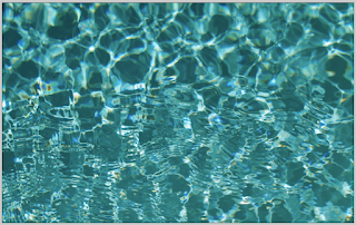
Step 2) Download your water image. I've chose this one from CGtextures. You can pick any image you want.
Step 3) Insert and transform your image so it fits on your canvas.
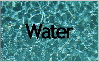
Step 4) Add your text, i've picked Tahoma, use the character tools (Window > Character) to change the distance between the letters. It doesn't matter what colour the text is, this will be removed using the blending options in the next couple of steps.
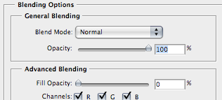
Step 5) The next couple of steps are all done through the layer blending options (Layer > Layer Style > Blending Options or double click the text layer). The first mini step is to change the advance blending options. This is done on the main page. Move the slider for fill opacity all the way down to zero. This will let you see the background through the text but all of the styling will be at 100% visible. Don't change the opacity in the general blending box otherwise you will not see any of the text.
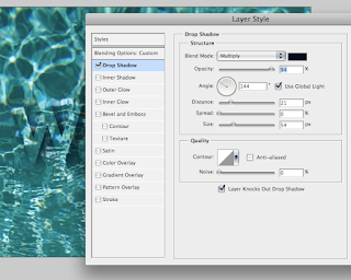
Step 6) Once as you have made the text invisible add a drop shadow. Use the values as shown in the image below. But for the best and most unique effect make them up as you go along.
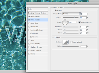
Step 7) Add in an inner shadow. This should be white and follow the same angle as the drop shadow. Check "Use Global Light" to ensure this.
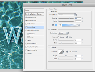
Step 8) Add your inner glow. Add in a light blue. This will eventually blend in more with the water background.
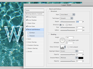
Step 9) In the Bevel and emboss option add in the values shown. Make sure you change the gloss contour to the wavy line. Otherwise it will not look as good as it could be.
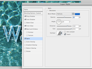
Step 10) Add in a Satin. I don't use this option that much so it was a change to use it. Satin adds a bit of a colour overlay but you change change a play around with the values. This will add in a light blue effect.
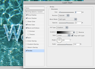
Step 11) Final step is to add a gradient stroke. Change the blending option to soft light. This will enable some of the background to shown through. The soft light setting will be use a lot in the next couple of steps.
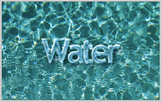
The water text is done. But we can spruce up the background and change the greenish tinge to a bit more blue.
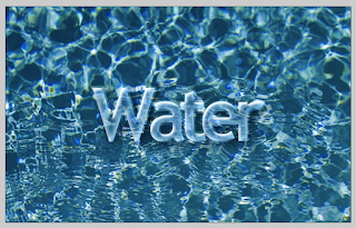
Step 12) Adjust the Hue/Saturation ( Image > Adjustments > Hue/Saturation) make it more blue. Notice how the background and the text seem to blend in more.
Step 13) The next step is to add in the back edges. Insert a new layer. Apply a radial gradient of transparent to black. Set the blending option to soft light.
Step 14) The next steps I have forgot to create images as I was doing this. Using the same method as mentioned in step 13, add a small flat nothing to black gradient. This will be used as a shadow for the whole piece.
Step 15) At this point the piece looks very dark. We want a very computerized blue. To do this create a new layer underneath everything (but make sure the background layer of white is still at the bottom). Apply a gradient of a light blue to dark blue onto the canvas. Change the settings so the gradient is radial and apply it to the piece.
Step 16) Reduce the opacity of this new layer to about 50%.
Step 17) Change the water layer (the image layer) to soft light. This will show through some of the blue in the layer underneath it. The blue gradient layer was reduced in opacity to soften the effect.
The effect is pretty much done. If you want to increase the darkness of any of the layers duplicate them (Cmd/Ctrl + J) and then reduce the opacity of this new layer. I have done this for the edge layers.
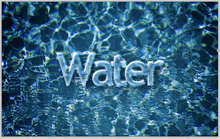
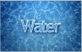
The final image is shown below (some text size adjustments). If you need any help or you want to leave and comments please do so below. Click for the full size.

Step 1) Create your canvas, and artist can't work out of thin air. I've chosen 1440 x 900 pixels so it matches my desktops.
Step 2) Download your water image. I've chose this one from CGtextures. You can pick any image you want.
Step 3) Insert and transform your image so it fits on your canvas.

Step 4) Add your text, i've picked Tahoma, use the character tools (Window > Character) to change the distance between the letters. It doesn't matter what colour the text is, this will be removed using the blending options in the next couple of steps.

Step 5) The next couple of steps are all done through the layer blending options (Layer > Layer Style > Blending Options or double click the text layer). The first mini step is to change the advance blending options. This is done on the main page. Move the slider for fill opacity all the way down to zero. This will let you see the background through the text but all of the styling will be at 100% visible. Don't change the opacity in the general blending box otherwise you will not see any of the text.

Step 6) Once as you have made the text invisible add a drop shadow. Use the values as shown in the image below. But for the best and most unique effect make them up as you go along.

Step 7) Add in an inner shadow. This should be white and follow the same angle as the drop shadow. Check "Use Global Light" to ensure this.

Step 8) Add your inner glow. Add in a light blue. This will eventually blend in more with the water background.

Step 9) In the Bevel and emboss option add in the values shown. Make sure you change the gloss contour to the wavy line. Otherwise it will not look as good as it could be.

Step 10) Add in a Satin. I don't use this option that much so it was a change to use it. Satin adds a bit of a colour overlay but you change change a play around with the values. This will add in a light blue effect.

Step 11) Final step is to add a gradient stroke. Change the blending option to soft light. This will enable some of the background to shown through. The soft light setting will be use a lot in the next couple of steps.

The water text is done. But we can spruce up the background and change the greenish tinge to a bit more blue.

Step 12) Adjust the Hue/Saturation ( Image > Adjustments > Hue/Saturation) make it more blue. Notice how the background and the text seem to blend in more.

Step 13) The next step is to add in the back edges. Insert a new layer. Apply a radial gradient of transparent to black. Set the blending option to soft light.

Step 14) The next steps I have forgot to create images as I was doing this. Using the same method as mentioned in step 13, add a small flat nothing to black gradient. This will be used as a shadow for the whole piece.
Step 15) At this point the piece looks very dark. We want a very computerized blue. To do this create a new layer underneath everything (but make sure the background layer of white is still at the bottom). Apply a gradient of a light blue to dark blue onto the canvas. Change the settings so the gradient is radial and apply it to the piece.
Step 16) Reduce the opacity of this new layer to about 50%.
Step 17) Change the water layer (the image layer) to soft light. This will show through some of the blue in the layer underneath it. The blue gradient layer was reduced in opacity to soften the effect.

The effect is pretty much done. If you want to increase the darkness of any of the layers duplicate them (Cmd/Ctrl + J) and then reduce the opacity of this new layer. I have done this for the edge layers.
The final image is shown below (some text size adjustments). If you need any help or you want to leave and comments please do so below. Click for the full size.


0 comments:
Post a Comment