Wednesday, December 31, 2008

Make Photos More Suggestive

1. Open a picture you like to make effect, in this tutorial I used Nelly Furtado model photo
Press Ctrl +J to duplicate layer
Go to Filter ~> Brush strokes ~> Spatter (Radius = 10, Smoothness = 5), choose mode = Lighten
Use Eraser tool (choose Soft brush) to remove spatters put on the picture


2. Create a new layer then go to Image ~> Apply Image ~> Ok
Continue to go to Filter ~> Blur ~> Motion Blur and adjust angle match with the sun light on the picture. Distance = 50
Set mode this layer: Lighten and continue erase parts put on the model


3. Create a new layer ~> Image ~> Apply Image ~> Ok
Use white Brush soft, 65px, Opacity=50% brush a line on the model and change mode = Soft light.


4. Go to Layer ~> New adjustment layer ~> Gradient Map. And do as the picture below, then change mode = Multiply, Opacity=60%


5. Make again Step 1 but this time you adjust Opacity=60%
Create a new layer and use Spazzsplatter brush to brush anywhere on the picture that you like
Use pen tool to draw a curved line, your picture will be softer


6. Make again Step 4 but now Opacity=70% and mode = Normal
Create a new layer Gradient Map like this:


Mode=Softlight, Opacity=40%


7. Create a new Gradient Map like this:


Mode=Softlight, Opacity=30%

Create a Glowing Light Painting Effect

Step 1

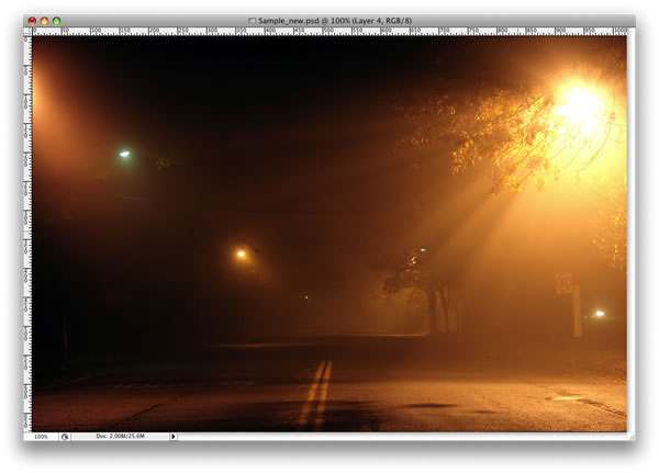
Create a new document and place the photo, you can download the one I used at: Photo 1.

Step 2

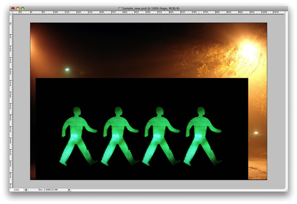
Here I placed a second image. I will use it to create the light effects. Here is the link for the next image: Photo 2.

Step 3

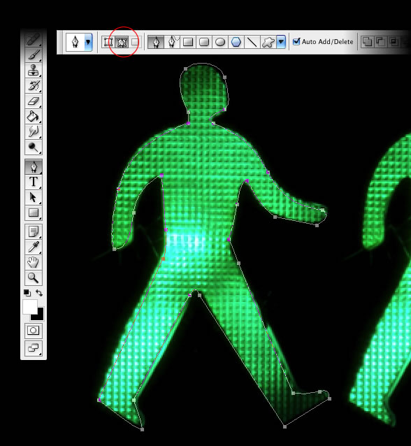
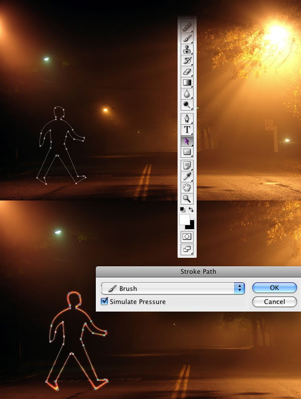
With the Pen Tool(P), create a path for one of the figures.

Step 4

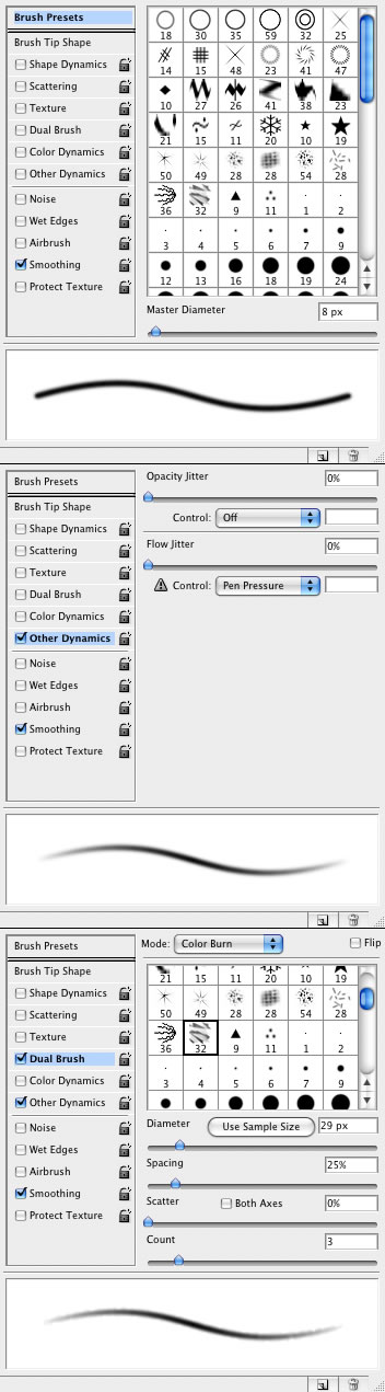
Select the Brush Tool(B) and go to Window>Brushes or F5 to create our brush. Use 8px for the diameter and select Dual Brush and Other Dynamics. Follow the image below for reference.

Step 5

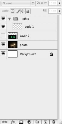
Go to the Layer Palette, create a new folder, and rename it to lights. After that create a new layer inside this folder, name it "dude", and select it.

Step 6

Go to the Path Palette and select the first path. Then with the Path Selection Tool(A), select the path and right-click. Choose Stroke Path. A dialog box will open; select the brush and use Simulate Pressure.

After that go to Filter>Blur>Gaussian Blur, use 1.6px for the amount.

Step 7

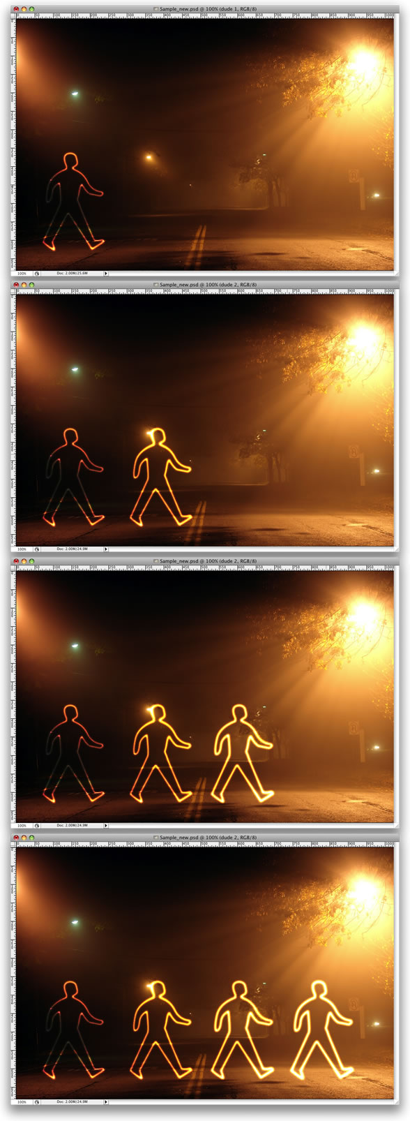
Duplicate the "dude" layer three times.

Step 8

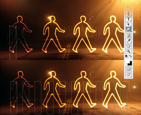
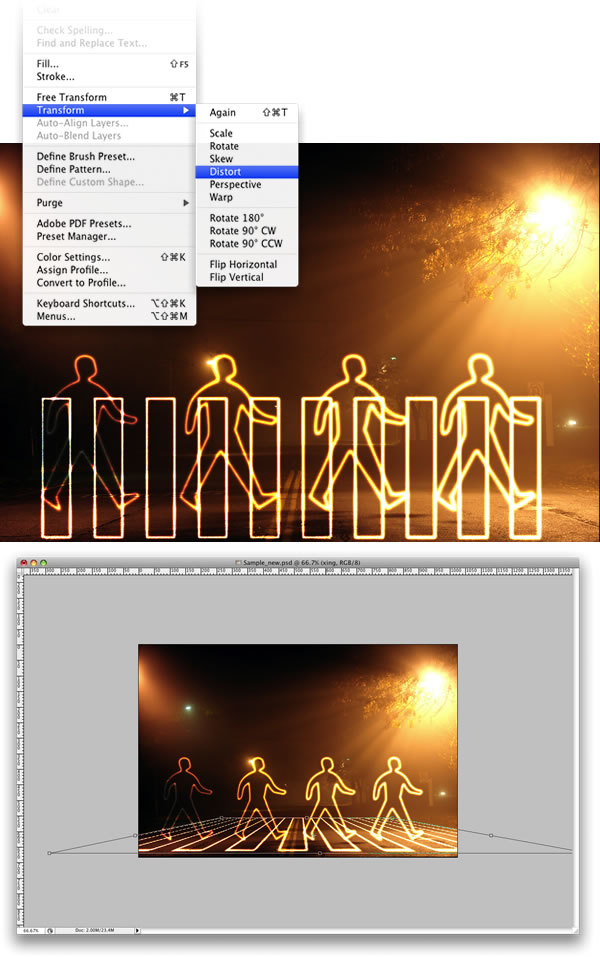
Select the Rectangle Tool (U) and create a rectangle. Then duplicate the rectangle several times. After that align and distribute them horizontally.

Step 9

Create a new layer inside the lights folder. Rename it to "xing". Repeat Step 6 and Stroke the paths. After that select the "xing" layer and go to Edit>Transform>Distort. Now just move the vertices until the perspective is good—just follow the street lines.

Conclusion

That's probably the easiest way to create this type of light effect; however, it depends on the color of the background. If the background is too dark, the blend mode won't work. You'll probably have to use another one with an Outer Glow.

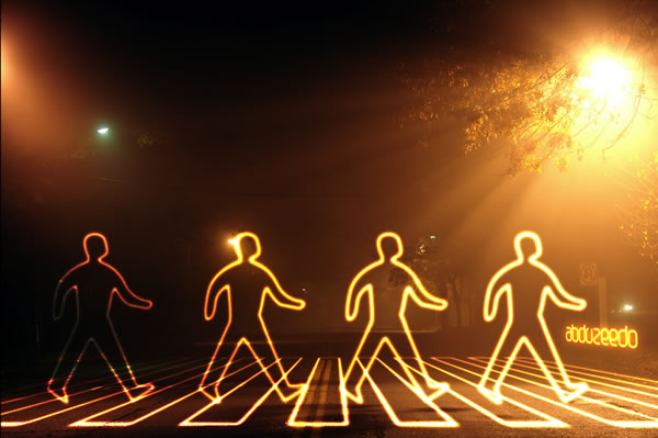
You can make the lights brighter by just duplicating the layers. You can even use the Eraser Tool(E) to make some adjustments. The original concept image can be viewed at Light Graffiti In Photoshop. The final tutorial image is below.

Smoke Effect

1. Step one, open a new image, it doesn't really matter what size but be sure to set your background color to black. (this effect generally looks its best on a black background.) Make a new layer and select the "Polygonal lasso tool" and create an abstract shape that looks similar to the example below.(It doesn't really matter what color you use here either, but just don't make it too dark, and feel free to experiment.)


2. Now we can start our highlights of our smoke. Select the "Dodge" tool and make the brush size around "50" and the "Range" to "highlights." Now use this tool around the edges and corners of your shape. Next, select the "Burn tool" and use it in the middle and wherever you see fit. You should have somthing that looks like this:


3. Here we can make it look like smoke now. Go to "filter"/"Distort"/"Wave." And make the settings as follows:

- Generators "5"
- Wavelength "10"/"120"
- Amplitude "5"/"35"
- Scale at "100%" for both.

4. Right after you have used the "wave" filter you can go to "Edit"/"Fade-Wave" and set the opacity to "50%." Now repeat this distort and fade method many times, or untill you think it looks best.


5. To make this effect look even better you may have to "distort", resize, and change the blending modes when fading a bit. And lastly, to make it different colors instead of the same throughout. make a new layer and use the "brush" tool all over the place using different colors. then set that layers "blending mode" to "Overlay." And there you have it, a simple yet effective smoke method!

It's amazing what you can do with some Adobe Photoshop training and a little time!

Tuesday, December 30, 2008

Apple Leopard text effects

One thing I’m impressed with about Apple’s new system GUI in Leopard is the “inset effect” on the text in combination with the new window chrome. Several people asked me about my opinion on Leopards GUI and I thought I combine this with another question I received on how to create this “inset effect” on text.
So I’ve decided to investigate this subtle effect further via Photoshop layer effects as well as Illustrator’s effects.

In Photoshop

Creating the chrome bar

As shown in the image below, I've started by drawing a rectangle using the Rectangle Tool. I've filled it with a mid grey (but actually, it doesn't matter which fill you give it, since we'll add a gradient fill Style over the top of this box). In the Layers palette, double-click on the right side of this layer to activate the Styles on this layer (or click on the dark circle-ƒ at the bottom of the panel). Select the Gradient Overlay options. Set the Angle to 90º and click once in the gradient that is shown as Gradient option to change its values. Click the left slider swatch once and click in the color swatch below to change this value. Enter #949494. Do the same for the right swatch and change it to #d1d1d1. Click OK to accept the Gradient Overlay setting. With the Effect options still open, click the Drop Shadow option. Enter black (or #000000) as color, 20% Opacity, 90º as Angle, 1 for Distance and 0 for Spread and Size. Click OK to accept the Style options.

Creating the chrome bar in Photoshop

Now as you can see on the 2nd picture, I've zoomed in on the rectangle box. To achieve the exact effect you need to make sure that the path of the bottom of the rectangle is right in between a pixel so you have this 1 pixel blurry effect and the exact same drop shadow effect (as the main navigation bar on Apple's website).

Creating the inset text

Select the Type tool and type the text that you want. Select Left align in the Toolbar, Myriad Pro Regular as typeface and #383838 as color. Now double-click to the right of this text layer in the Layers palette to activate the Styles on this layer and click the Drop Shadow option. Select 'Normal' from the Blend Mode dropdown and choose white as color. Enter 50% opacity, set the Angle to 90º, 1 for Distance and 0 for Spread and Size. Click OK to accept the Style options. That's it :)

Creating the inset text in Photoshop

In Illustrator

Creating the chrome bar

If you're a vector designer, this method is just as simple. Select the Rectangle tool and draw a rectangle. Objects have a white fill and a black border by default. Click the border color at the bottom of the Toolbox and select the 'None' swatch below (white square with red diagonal line). Now select the Fill swatch and go to the Gradient palette. If the palette is not on your screen go to the Window menu and choose Gradient (or hit command/control + F9). Double click the left color swatch, the Color palette will show up with white as color and Grayscale as color mode. Enter 20% as grayscale value. Now click the swatch on the right of the gradient and enter 55% as grayscale value. Go back to the Gradient palette and change the angle of the gradient to 270º.

Creating the chrome bar in Illustrator

With the rectangle selected go to the Effects menu and choose Drop Shadow from the Stylize submenu. Enter 20% as Opacity, 0 pt for X Offset, 2 pt for Y Offset and 1 pt for Blur. Leave the black color and 'Multiply' option unchanged and click OK. If you go to the Appearance palette you'll see that there is an Effect added. Double clicking this effect will open the Drop Shadow options again where you can change these settings. So it's very flexible. Effects are modifiable and therefore very flexible. Filters on the other hand are not. If you've ever wondered what the difference was between Filters and Effects in Illustrator when trying to achieve the same result, then you'll realize that this is a big difference. Once Filters are applied they can't be changed. So keep this in mind.

Creating the inset text

Creating the inset text in Illustrator

Select the Type tool from the toolbox, click on the canvas in the bar you've just created and type your text. Choose Left align text from the Paragraph palette and Myriad Pro Regular from the Character palette (go to the Window menu if the palettes are not visible). Now go to the Effects menu and choose Drop Shadow from the Stylize submenu. Choose 'Normal' from the Mode dropdown menu, enter 50% as Opacity, 0 pt for X Offset, 1 pt for Y Offset and 0 pt for Blur. Change the black color to white and click OK. Deselect your text, double click the Zoom Tool in the toolbox to go back to 100% (or hit command/control+alt/option+0 for CS3). There you have it.


design by Nur for Cool Style Graphics.