
Step 1
Before getting started, you'll have to download the font Sega from dafont and install it. Installation is quite simple, in the configuration panel you can find a folder called Fonts, simply paste the file there and then fire up Photoshop.
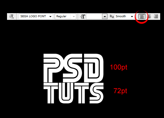
The first step is quite simple. Fill your original layer with black and rename it to "background." Type out the text you want, preferably something more or less square, as shown below. Make sure that the text is adjusted towards the left. Right now you should have a layer with the background color and another layer with your text. In my example, I used 100pt text for the PSD part and 72pt text for the tuts part to make the width match.
Step 2
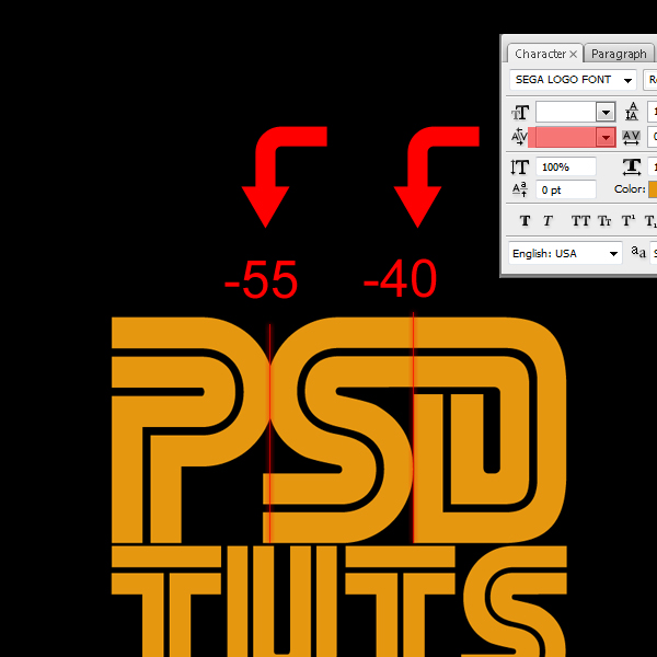
Now let's modify the text a bit. Open up the character palette for this (Window > Character). The field below the Text Size allows you to set the kerning between characters. Kerning determines the distance between two characters in relation to each other. So when you select your Type Tool and you put it between two characters, you can adjust the spacing between these two characters.
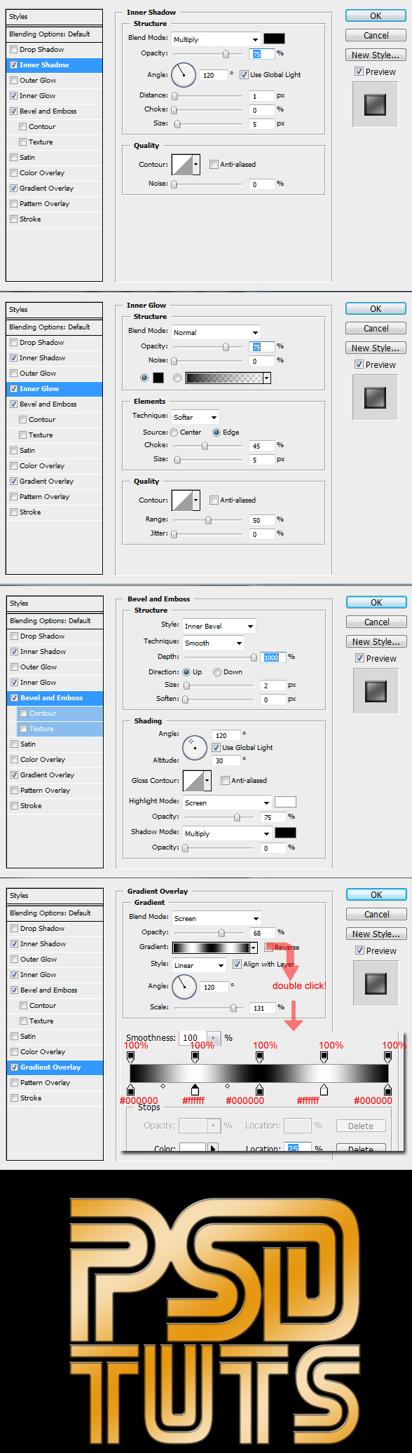
First, let's change the color of the text to #e59710. This is a good base color when you are aiming for gold, then we can stretch our text by either using Free Transform (Command + T), or by changing the character size. After blowing up the text, my top row of text has a size of 280pt and the bottom one has a size of 194,4pt.
Now we can do the actual kerning. After having selected the Type Tool, place the cursor between the P and the S, and I set the kerning to -55. This way we get a pretty nice connection between those two characters. Then place the cursor between the S and the D, set the kerning to -40.
Step 3
Now let's style the text. Think about this for a second; we want nice gold like text, with a bit of a distinguishable edge and a slight beveled 3D look. So, we'll need to use bevel to get depth on the outside, a little bit of inner shadow for depth on the inside and a gradient for the highlights.
Now to accentuate the bevel, we will use an inner glow. While below the screenshots are placed in descending order according to the Photoshop interface. I myself will generally start by adding the gradient first, then the bevel, and then the glows and shadows.
Step 4
Time to get our perspective going! First you will have to rasterize the layer. So duplicate the text layer (Always keep an editable duplicate of a text layer! ALWAYS!) and then add another layer on top of the duplicate. Now select your duplicated text and your now empty layer, then merge them using Command + E. Unlike rasterizing a layer through the Layer tab at the top of the screen, this method will also rasterize the layer style.
In this case, it's a good thing because we want the style to move along with the distortion. If you were to do it via the Layer tab, the layer style would adjust back to a planar distortion. In short: This way is better because it gets rid of the fx sign.
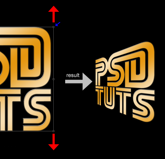
Now with your rasterized type layer you should go to Edit > Transform > Perspective. Grab the top right anchor point, and while holding shift, drag it up. Additionally, you can grab the left anchor point, and holding shift, drag it down a bit to create more of a depth effect. Then scale the text down a little to get rid of the blur.
Step 5
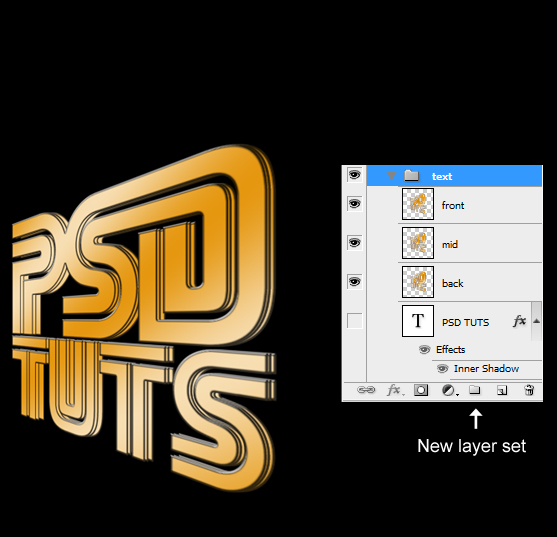
Duplicate the distorted text two times, now drop these three layers in a layer set called "text." Change the name of the top layer (of the three) to "front," middle layer to "mid," and the bottom layer to "back."
Using the arrow keys nudge the bottom and middle layer to the right until you get something like in the image below. As you can see the "back" layer needs to be a fair bit away from the "front" layer, while the "mid" layer should be a bit closer.
Step 6
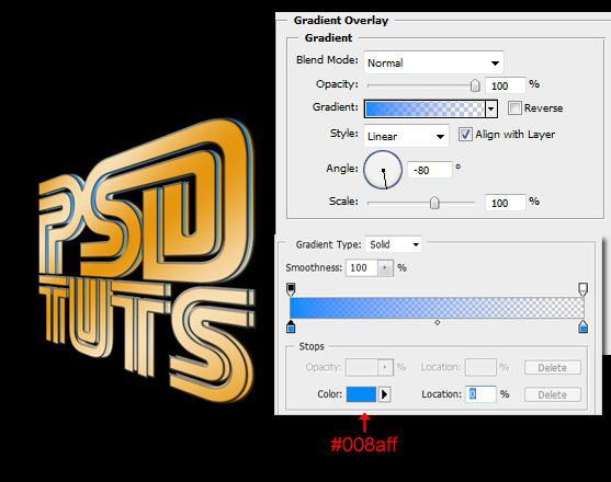
Select the "mid" layer and set the fill to 0% (the fill is located underneath Opacity in the layer palette). Now using layer styles, apply a Gradient Overlay. A quick way to do this is by selecting the Foreground to Transparent Gradient. That is the second gradient on the top row from the left, simply click on the triangle next to the gradient field to drop down the different gradients. Then change the foreground color to #008aff.
Step 7
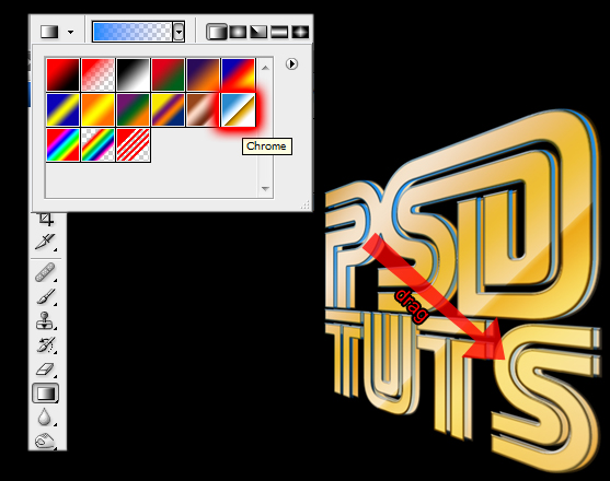
Create a new layer above the "front" layer and call it "chrome grad." Now, Command-click on the "front" layer to get a selection area. Select the Gradient Tool (press on the paintbucket and hold, then select the gradient tool) and choose the chrome gradient. Now run this from from the top left corner to the bottom right of your selection area. Then change the Blending Mode of the layer to Soft Light.
Step 8
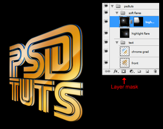
Create a whole new Layer Set and call it "soft flares." Now if this layer set ends up in the "text" layer set, you can simply drag it out of there and position it above the "text" layerset. Now, inside the "soft flares" layerset create a new layer and call it "highlight flare." Fill this layer with black and then go to Filter > Render > Lens Flare, and choose the 100mm Prime Lens with a default brightness of 100%.
Position the highlight where you want, I put it on the top part of the letter S in TUTS. Change this layer's Blending Mode to Soft Light and duplicate it. Now position it somewhere else, I put it between the P and the S.
Using a mask brush away a part of the duplicate because when you have two layers of black that are overlapping, it will be noticeable in the brightness of the text. Next, use a black brush to fill up all of the transparent areas on both layers, which emerged while we were rotating and resizing the flares.
This is important because again, it will be noticeable on background elements, which will be added at a later stage. It's best to fix it now, then to go back to it later on and find out which layer is causing the issue, especially in projects where layers reach beyond the 100 mark this can be a very annoying problem.
Step 9
Now as you can see on the last screenshot, both the "text" and "soft flares" sets have been dropped into the "psdtuts" set. Let's add a reflection. Duplicate this set and rasterize it as we did before. Create a new layer, select both of them, and hit Command + E.
Go to Edit > Transform > Flip Vertical and position the reflection under the original text. Go to Edit > Transform > Skew to fix the reflection (because we need the T of TUTS to line up). Grab the left middle anchor point and drag it up. Add a mask to the new layer called "reflection," then using a black to white gradient (you can just select the default gradient by hitting D on your keyboard to set the colors back to default), create a nice fade.

Step 10
Between the "reflection" layer and the "psdtuts" set create a new layer and name it "flare front." Fill it with black and go to Filter > Render > Lens Flare, and pick the 50-300mm Zoom at 100% brightness. Position this layer on a nice spot and set its Blending Mode to Linear Dodge (add).

Step 11
Duplicate the "flare front" layer, set the Blending Mode to Screen instead of Linear Dodge (add). Next, move it below the "psdtuts" set to position it behind the text. Let's name this layer "flare back."

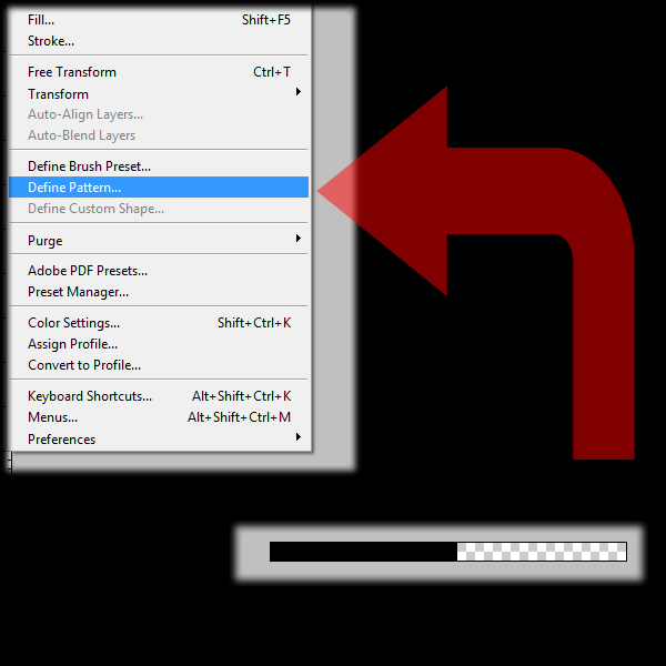
Step 12
Open up a new document (Command + N) with a size of 40px by 2px. Select half of this document with the Rectangular Selection Tool and fill it with black. In order to be more accurate with the selection you can turn on the rulers by hitting Command + R. Next go to Edit > Define Pattern, and give this pattern a name.
Step 13
Close that file and go back to our original file. Just above the "background" layer, which we made at the beginning of this tutorial, create a new layer. Go to Edit > Fill, and choose the pattern we just created. This should fill the screen with the pattern. Set the fill to 0%, then through Layer Styles, add a Color Overlay with the color #dd04ad. Lower the Opacity of this Overlay to 64%.

Conclusion
Hit Command + T and resize and rotate the stripes 90 degrees. Hit enter and go to Edit > Transform > Perspective. And just like we did before, except this time on the right side you need to grab the upper corner anchor point, then while holding Shift, drag it down. This will narrow that side, in effect making it look as if it's going away from you.
On the left side, you grab the top corner and drag it up, while holding Shift, making it look as if it's coming towards you. Notice the funny effect you get with the text standing on a part of the lines, it looks as if the lines are actually bending, but they're not! And that's it! Have fun experimenting with this text effect!


2 comments:
salam,
TQ. memang powerful teknik dan tip yang you listkan ni. kalau dapat you tolong PDF kan bagus juga untuk kita buat simpanan rujukan akan datang :)
saya suka tip vintage tu.
welcome...
insya-allah... ada ms sy pdfkn nyew...
Post a Comment